Component · cursor-follower
Cursor follower
A precise dot and a ring that trails it, grows into a label over work, wraps nav links like a magnet and gets out of the way over text fields. Switches itself off on touch.
Vanilla JS2 KBContext labelsOff on touchReduced motion
On a phone there is no cursor, so this component switches itself off. The tiles keep their own tap and focus states.
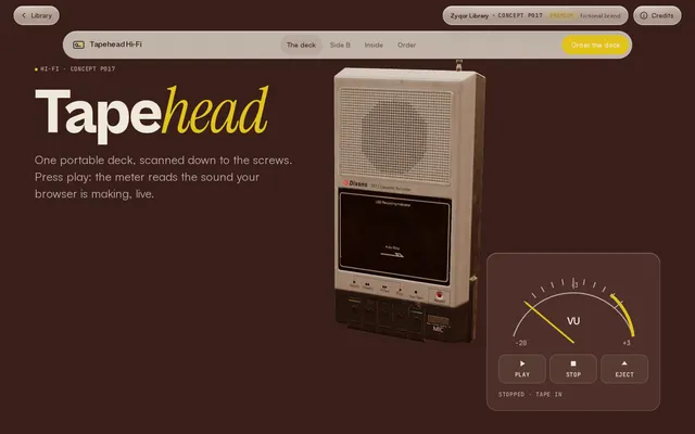
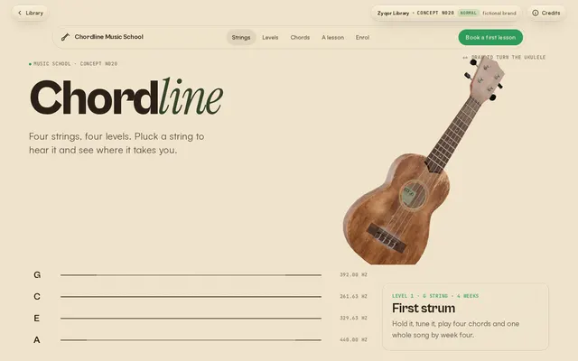
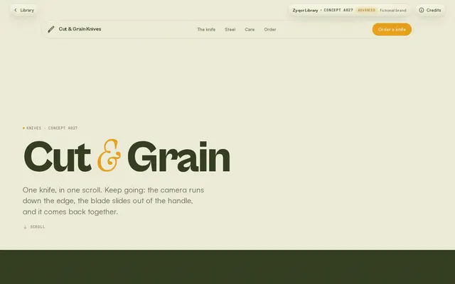
Use it
Copy the folder cursor-follower/ (the .js and .css files) into your project. No build step and no framework.
Behaviour
- Runs only with
hover:hover and pointer:fine; on touch it returnsnulland adds nothing to the page. - Over text fields the follower hides and the normal caret shows.
- The loop stops when the ring has caught up (no idle animation frames).
prefers-reduced-motion: no lag, the ring sits exactly on the pointer.- Decorative only:
aria-hidden, never moves focus.
Credits
- Spec from Sujon's Drive guide (MA 6.4: dot exact, ring lerp 0.16, context labels, off on touch).
- Seen on award sites such as A24 by Ravi Klaassens (Awwwards SOTD Oct 26 2026) and Lusion. Written from scratch.
<link rel="stylesheet" href="cursor-follower.css">

<a href="/work/tapehead" data-cursor="View">...</a>
<a href="/studio" data-cursor-stick>Studio</a>
<video data-cursor-hide ...></video>

<script type="module">
  import { cursorFollower } from './cursor-follower.js';
  cursorFollower({ lerp: 0.16, hideNative: true }); // returns null on touch devices
</script>| Option | Default | What it does |
|---|---|---|
| lerp | 0.16 | Ring lag: 1 = no lag, 0.08 = very floaty. Forced to 1 under reduced motion. |
| hideNative | true | Hide the system cursor (text fields always keep the caret). |
| data-cursor="Word" | Grow into a filled circle that shows the word. | |
| data-cursor-stick | Ring wraps the element and leans with the pointer. | |
| data-cursor-color | ink | Ring colour for that element. |
| data-cursor-hide | Hide the follower over this element. |